Project One of Two
Caesars Entertainment
Unified Customer Profile
SITUATION: Improve guest interactions with the front desk.
CHALLENGE: Low customer satisfaction scores through Trip Advisor and Yelp suggested inconsistent exchanges with the front desk at Caesars Entertainment properties. Additionally, turnover and complaints from front-line employees about system issues involving manual tasks, wait times, and communication issues prompted a research study to examine these processes and create a proof of concept to explore potential solutions.
TASK: Provide all guest information to front-line employees to improve interactions, efficiency, and customer service.
ACTION: Directed research and strategy, Design Thinking Workshops, and created a proof of concept for Caesars Palace, LINQ, and Cromwell.
RESULTS:
Future State Roadmap
Revised platform powered by Salesforce
Profile that shares guest information with internal departments
VIP level of customer service with every customer interaction
PROCESS
Step One: Employee Personas
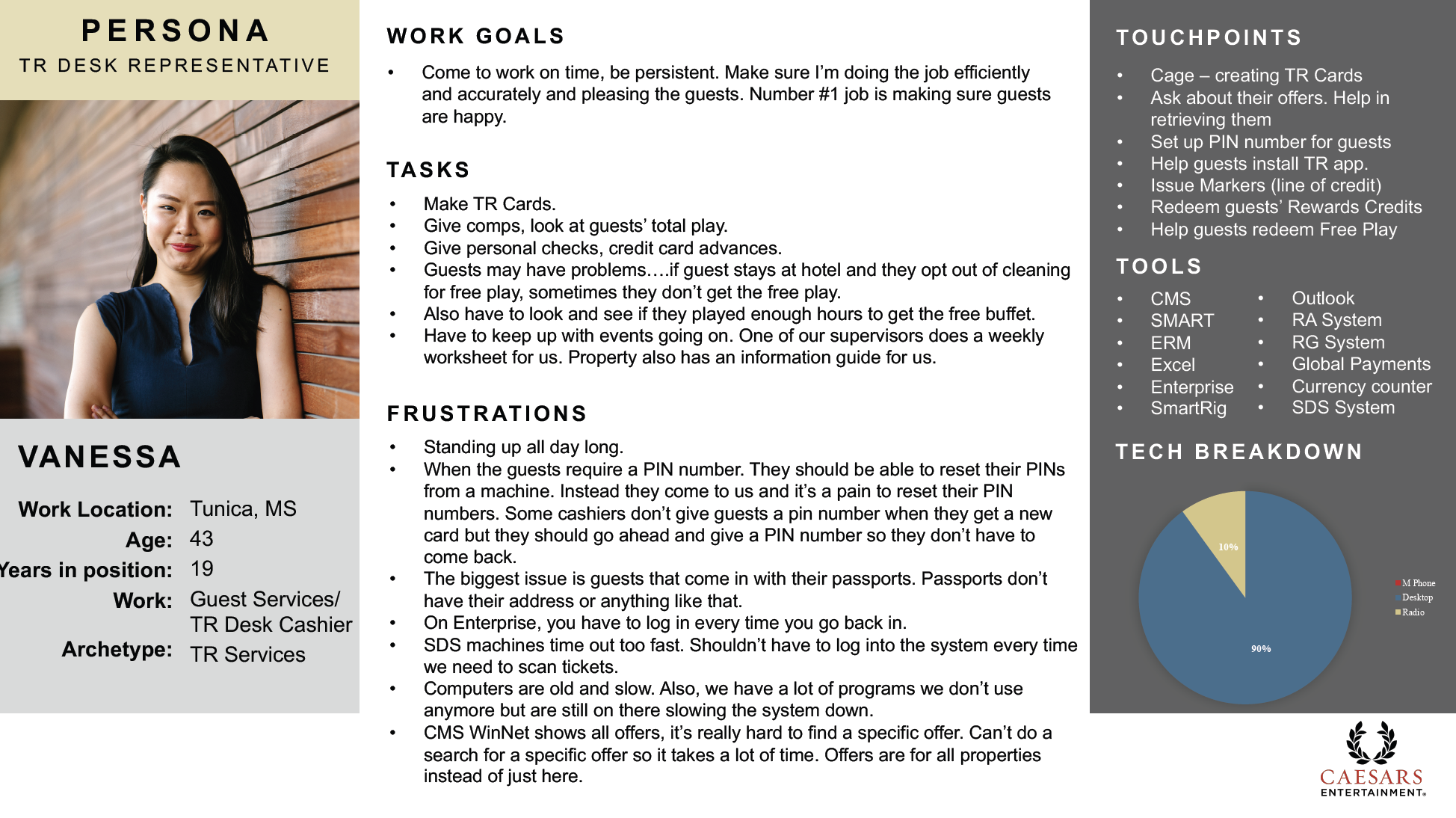
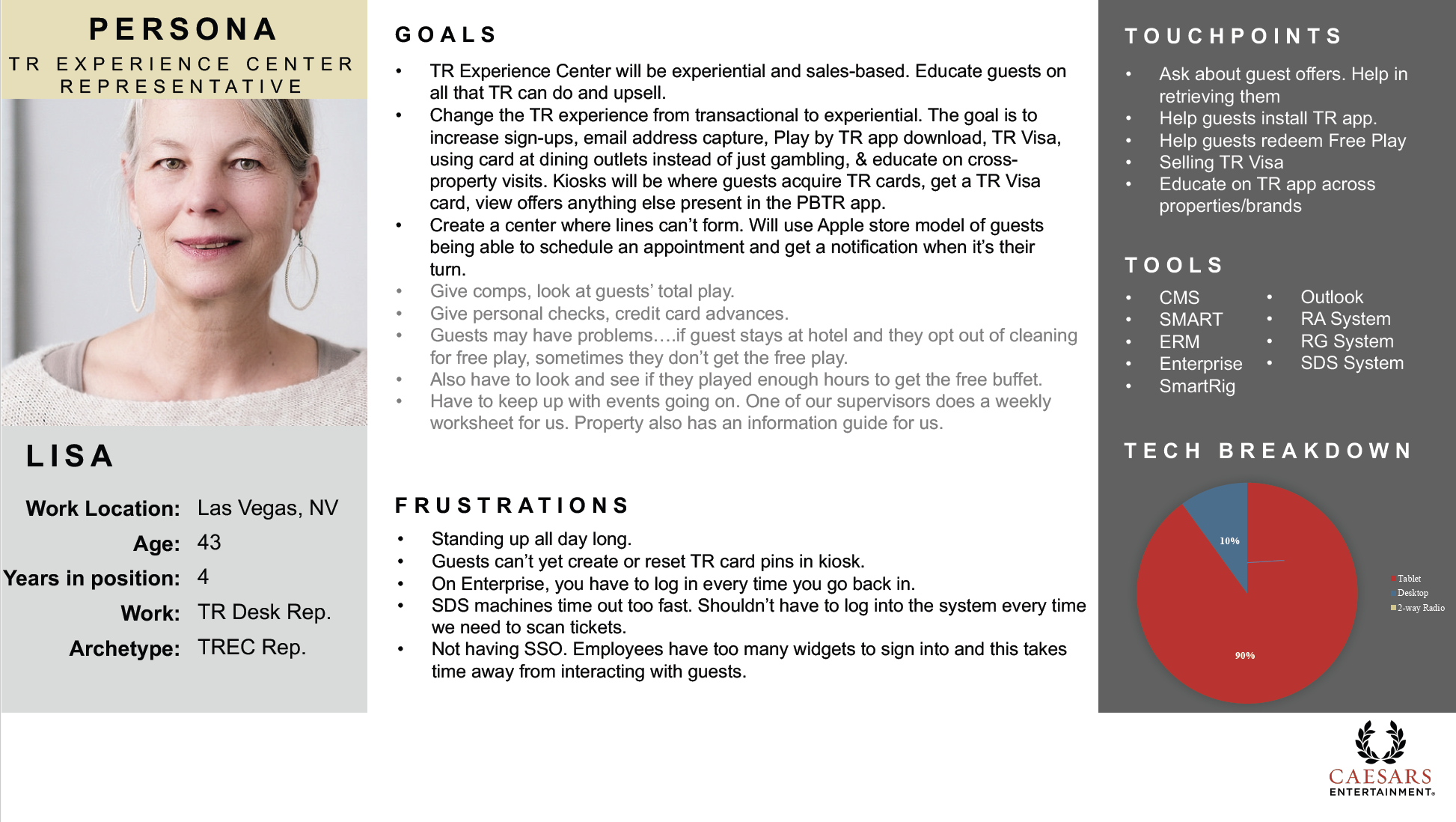
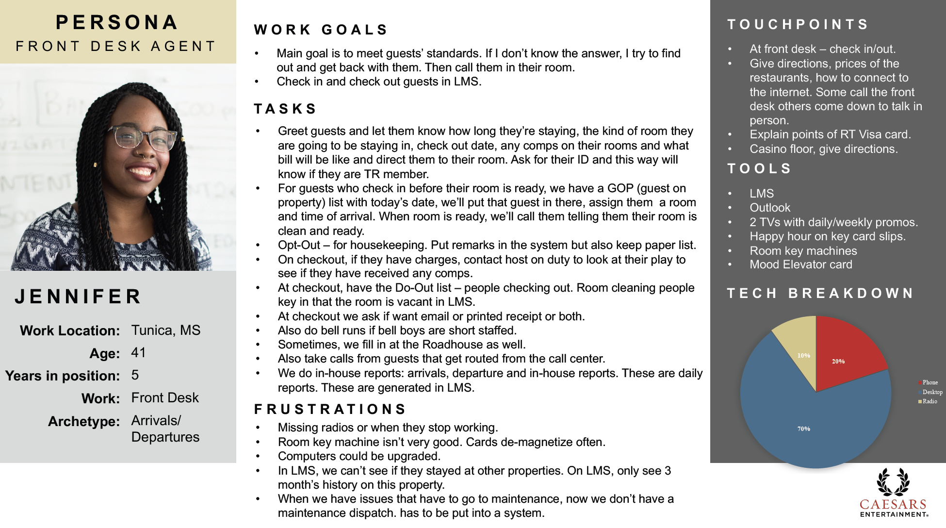
To provide potential solutions, it was necessary to understand the problems front-line workers were experiencing with the current system and how that affected customer service. Twenty-four front-line employees were interviewed across four property locations, including twelve front desk agents and twelve Total Rewards agents. This helped us understand their tasks and processes and how they might vary between properties.
The interviewees represented a combination of destination markets, different comfort levels with technology, varying receptivity to change, and a range of tenures with Caesars. Based on interviews, data, and customer feedback, employee personas were created.
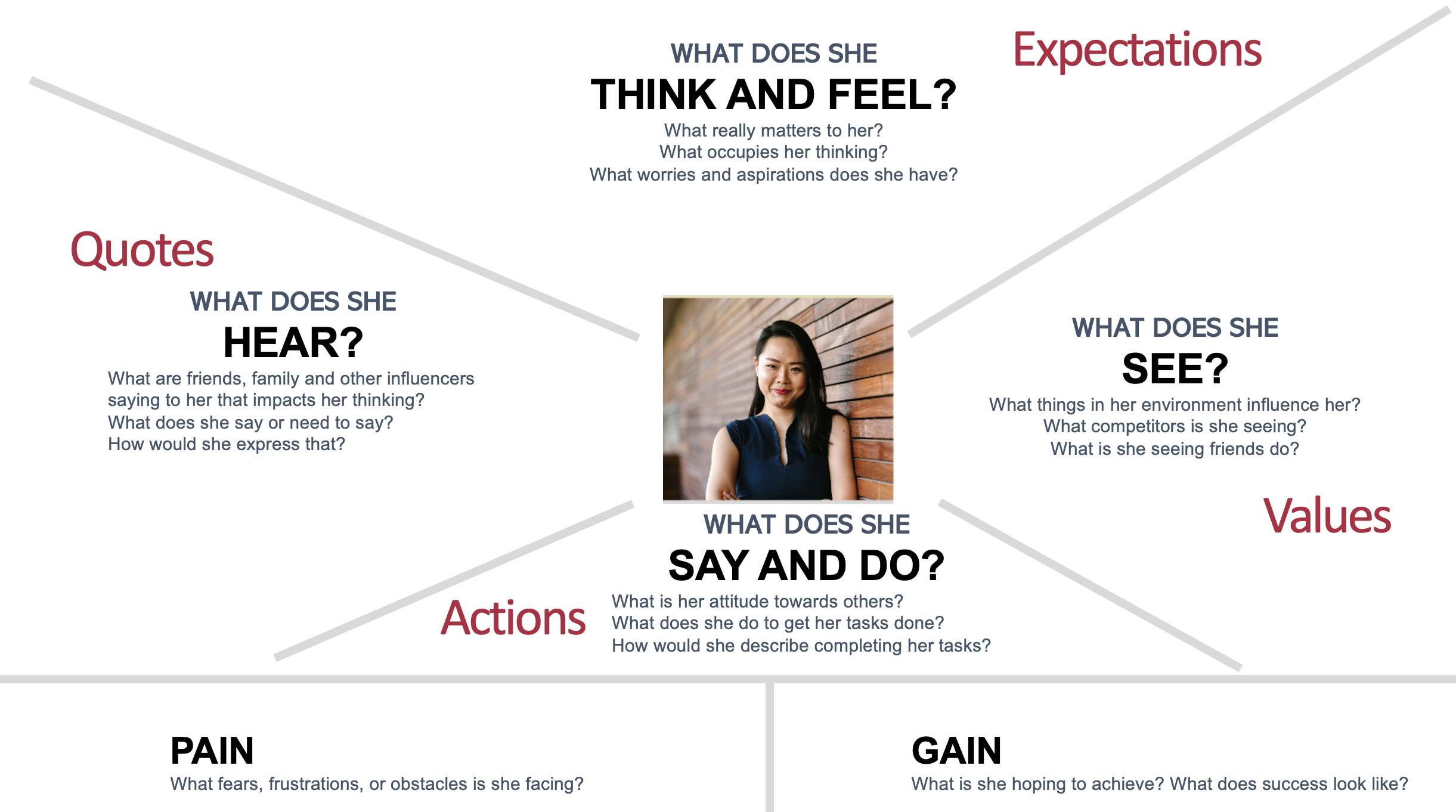
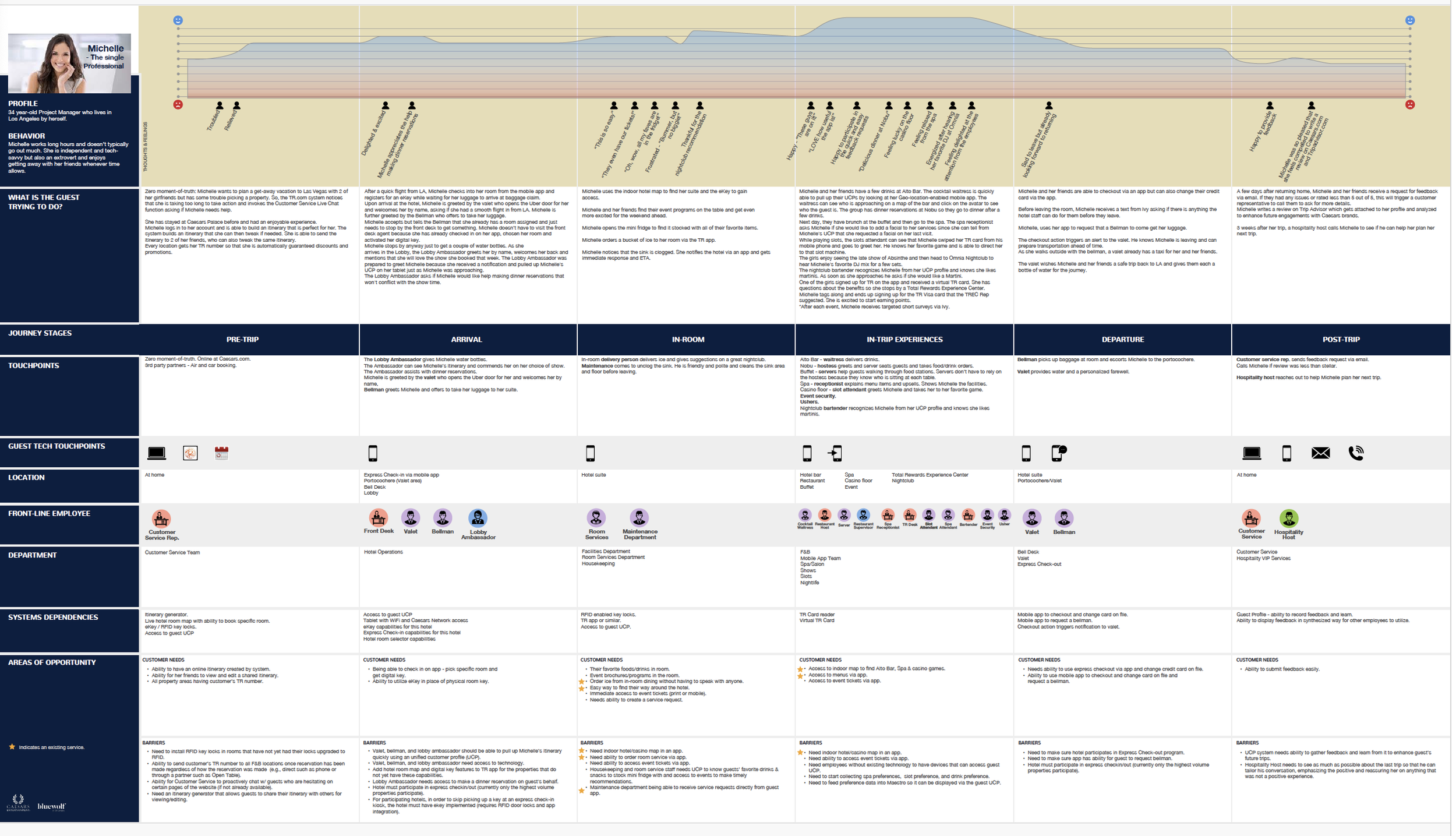
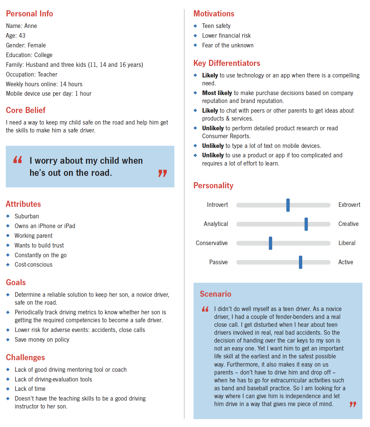
Step Two: Customer Personas
Understanding the interaction between primary customers and front-line employees was also critical. Based on data and customer feedback, customer personas were created.

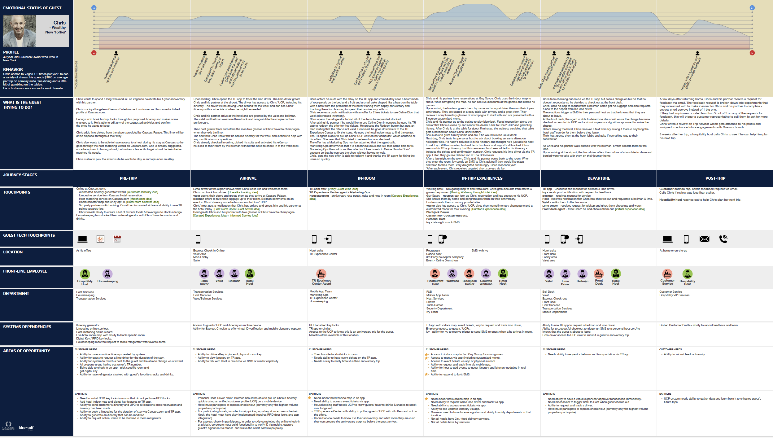
Personal Info: Chris, 56
Residence: New York
Spending: High, $50K/visit
Behavior: Chris visits Vegas one to two times yearly to see various shows. He prefers a luxury suite, fine dining, and table gambling. He is fashion-conscious and a world traveler.

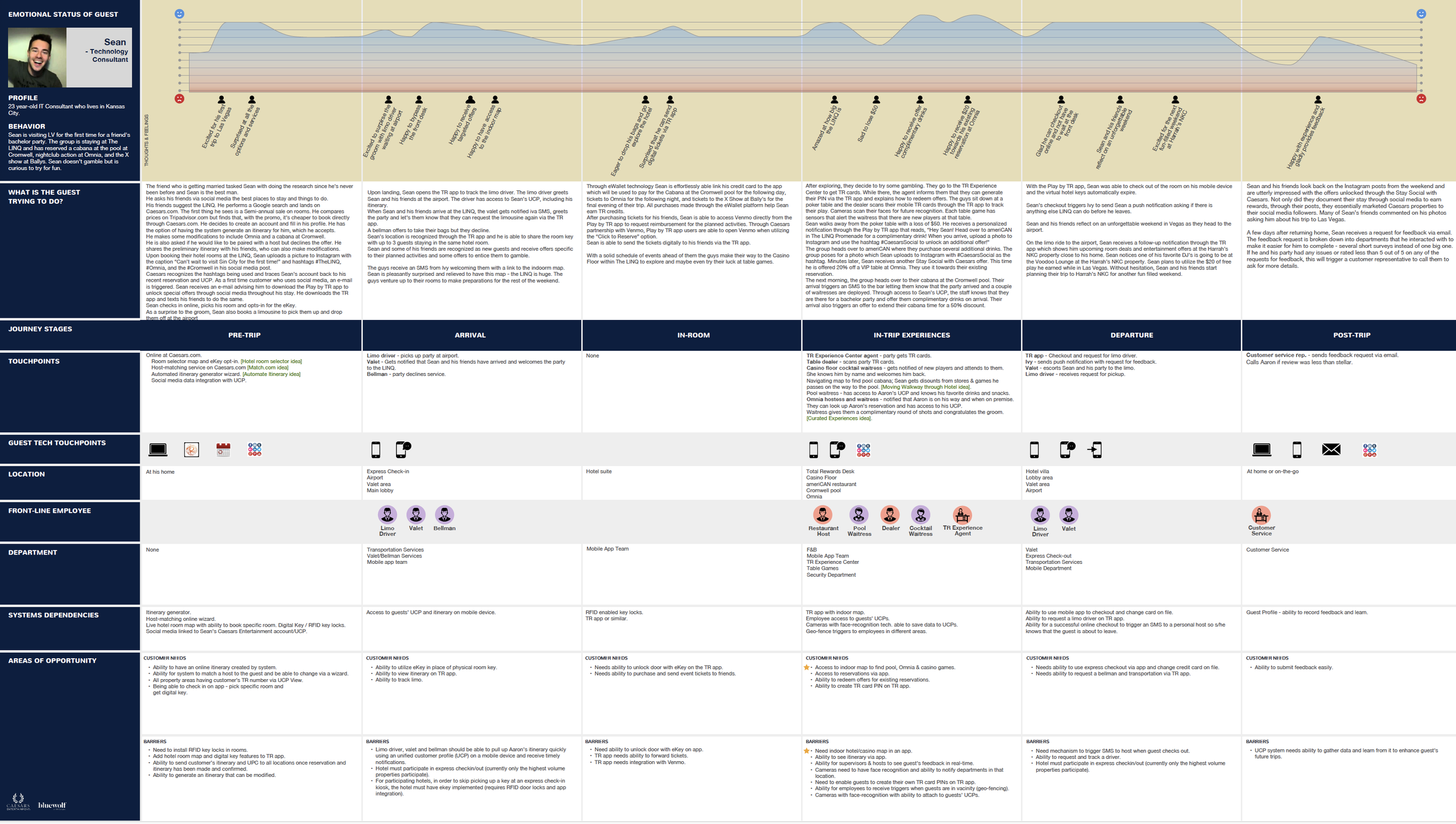
Personal Info: Sean, 31
Residence: Kansas City
Spending: Moderate, <$2K/visit
Behavior: Sean is a first-time visitor attending a friend’s bachelor party. The group reserved a cabana at The Cromwell's pool and Omnia's nightclub. The friends aren’t gamblers but may try the slot machines for fun.

Personal Info: Michelle, 40
Residence: Los Angeles
Spending: Moderate, <$4K/visit
Behavior: Michelle works long hours and doesn’t go out much. She is independent and tech-savvy. She enjoys getting away with friends to relax and dine at celebrity restaurants.
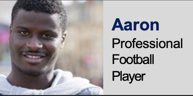
Personal Info: Aaron, 23
Residence: Dallas
Spending: High, $100K/visit
Behavior: Aaron has visited Caesars Palace twice and spent at least $100K per visit. He tends not to book his trips in advance and enjoys table games, fine dining, and entertainment.
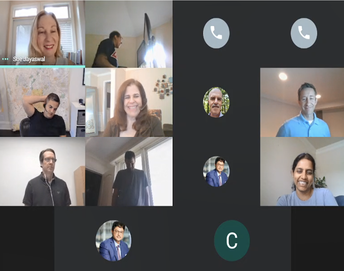
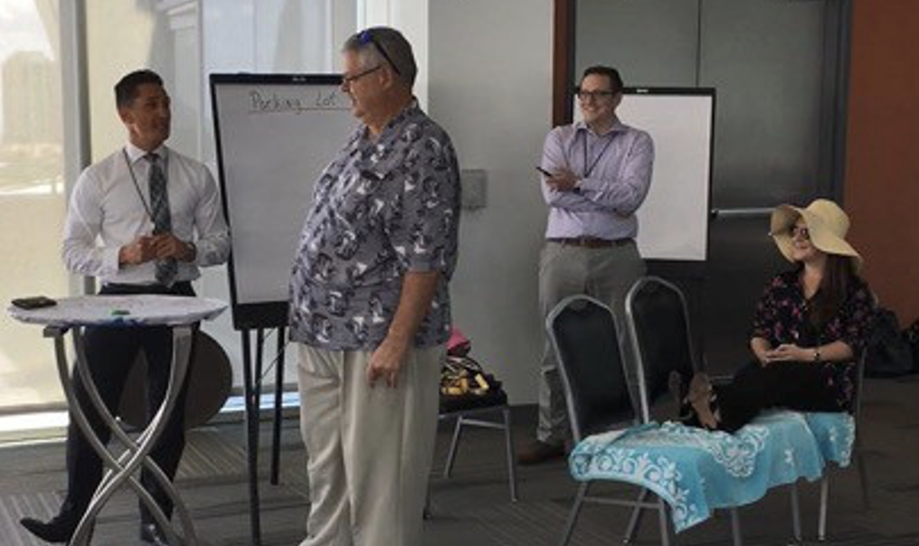
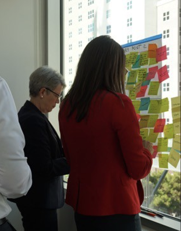
Step Three: Design Thinking Workshops
Small groups from Caesars, including front desk agents, F&B teams, VIP Hosts, Total Rewards, and supervisors, participated in Design Thinking exercises to understand common pain points among front-line employees and customers. The aim was to empathize with these personas and identify future-state solutions.
Workshop activities included empathy maps, journey maps, story-boarding, and skits. Sessions were conducted in person at Caesars in Las Vegas and also online.

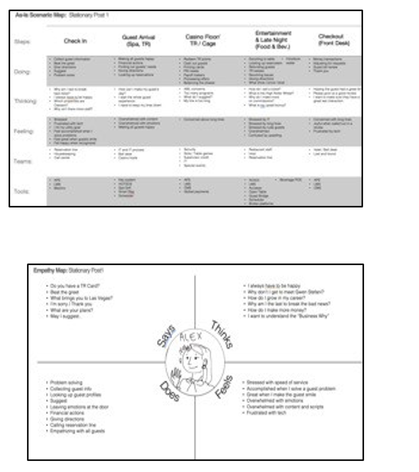
Customer Journeys were created from personas.

Step Four: Research and Results
A/B Testing, Contextual Inquiry, and Task Analysis were used to measure user satisfaction and determine a baseline for efficiency, process, and experience.
Sessions were conducted at Caesars and The Cromwell in Las Vegas and The Horseshoe Tunica in Robinsonville, Mississippi. Each session was 45 minutes and included twelve participants from these four properties.
Additionally, a survey was distributed to 300 front-line employees at six Caesars properties. Questions included system functionality, front-line tasks, customer requests, and the ability to complete them.
Current Application
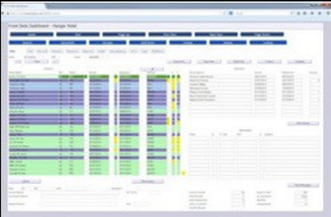
Note: Information blurred for security purposes.
Heavy data entry
Inability to scan information
Missing guest information
Unable to share data with other internal departments
Insufficient data impacted customer service quality
Prototype
Findings showed that the simplified UI design was easy to use and resolved most issues, providing intuitive screens, faster data retrieval, and departmental data collaboration. Participants said they could visualize the time saved using these features, believing that would improve customer service.
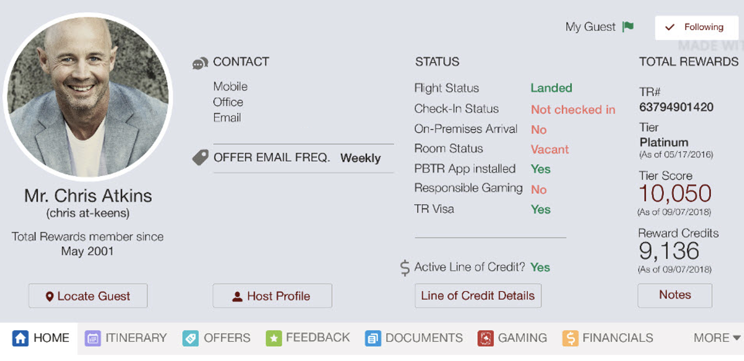
Easy access to data with tabs
Simplified, intuitive UI
Guest request tracking
Sharing data with other internal departments
Quick view to contact guest’s host, line of credit, history and preferences, and Total Rewards status
Project Two of Two
State Farm Insurance
Driver Application Re-design
SITUATION: Simplify Telematics app
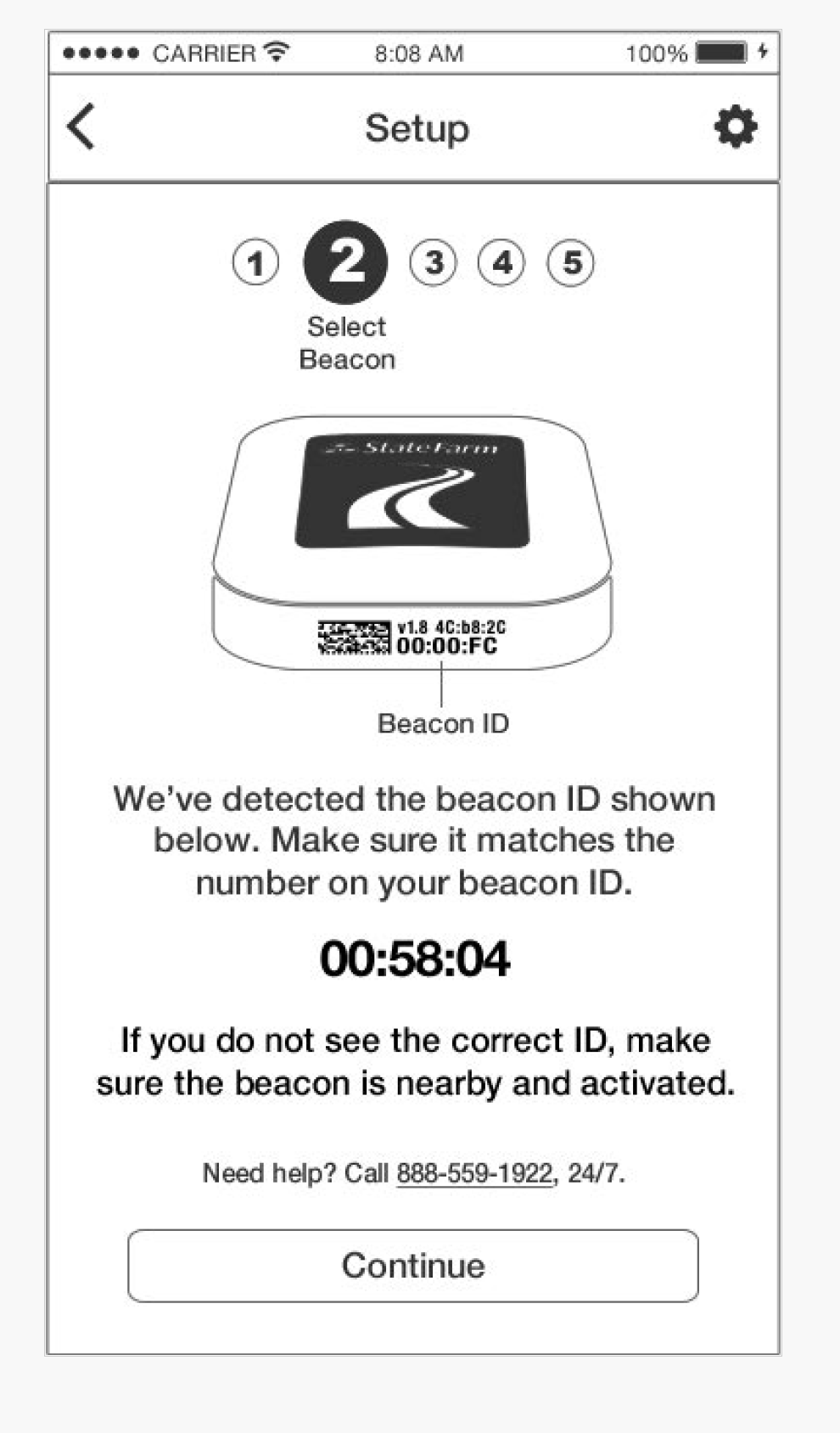
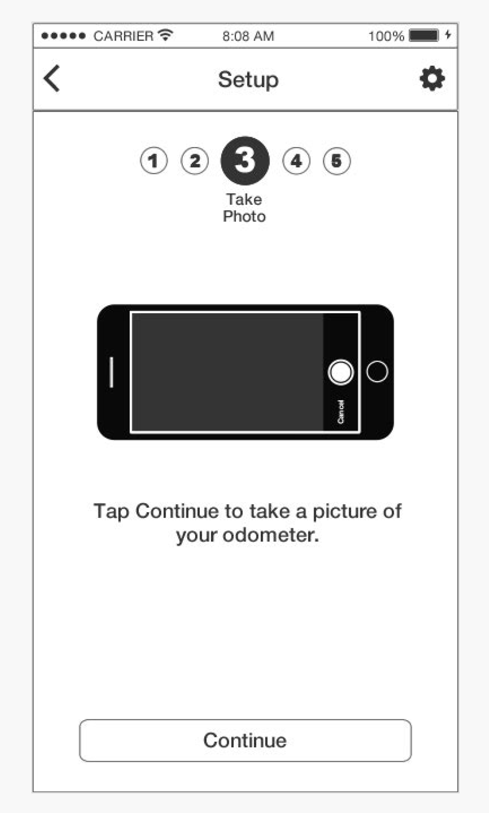
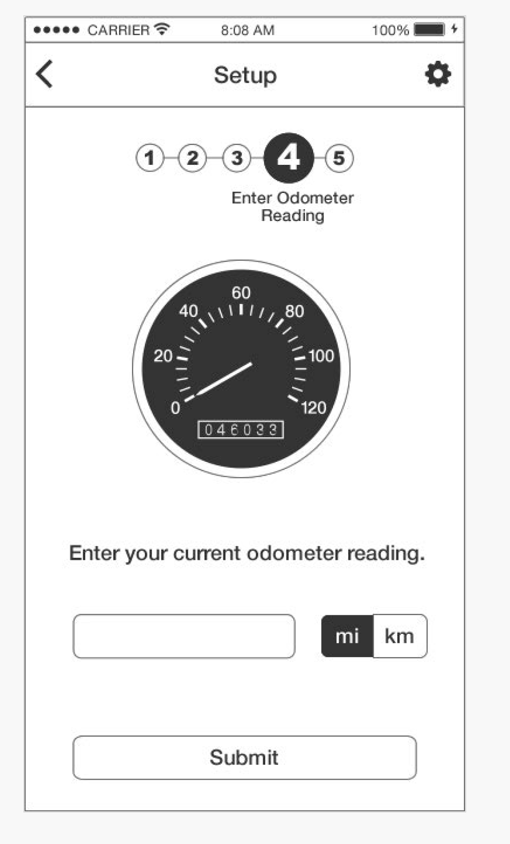
CHALLENGE: The number one pain point for customers was understanding the setup for the Drive Safe and Save application. Forty percent of support calls were beacon issues within the setup process. Customers said they did not understand the process, did not complete all the steps, or did not understand how to connect the app to the beacon device. This caused 48% of customers to abandon the setup.
Additionally, research findings reported data as inaccurate and not in real time. Due to similar functionality, customers conflated Drive Safe and Save with other State Farm apps like Driver Feedback and Steer Clear. I led a team tasked with simplifying the setup process, eliminating redundancy, enhancing features, consolidating where possible, and reimagining the dashboard design to increase customer engagement, retention, and completion rate.
TASK: Re-design the Drive Safe and Save (DSS) app to improve functionality and user experience
ACTION: Managed research and strategy, Design Thinking Workshops, and created a proof of concept for DSS.
RESULTS:
Increased customer retention and acquisition by improving setup, design, and functionality
Included new instructional video and scoring features
Sunset similar product
PROCESS
Step One: Customer Personas and Focus Groups
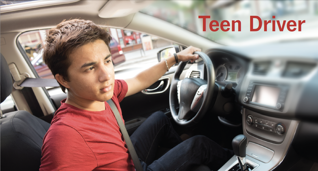
I guided the team in understanding customer challenges and motivations. According to internal research, two primary groups used the app or were interested in monitoring driving habits and/or receiving policy discounts: Teens and concerned parents.
The team conducted two focus groups, each with six people. They spoke with participants to understand their driving motivations, behaviors, and concerns, which helped create these personas.


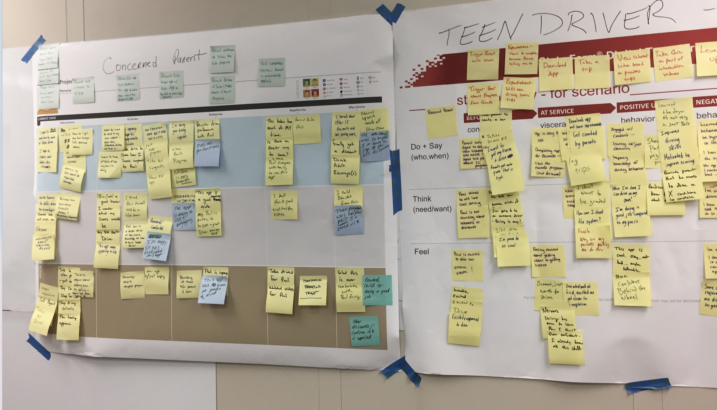
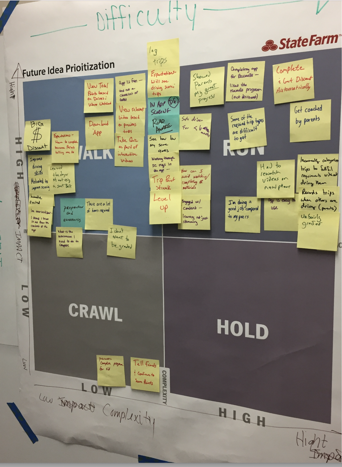
Step Two: Design Thinking Workshops
Small groups from State Farm, including developers, analysts, leadership, and Marketing, participated in Design Thinking exercises to understand customers' goals and frustrations. The aim was to empathize with these personas and identify future-state solutions.
Workshop activities included empathy maps, journey maps, SWOT analysis, prioritization exercises, and skits. Sessions were conducted in person in Bloomington, Illinois, and online.
These methods helped teams visualize potential solutions and determine their feasibility, instilling confidence in the process.


Step Three: Research and Results
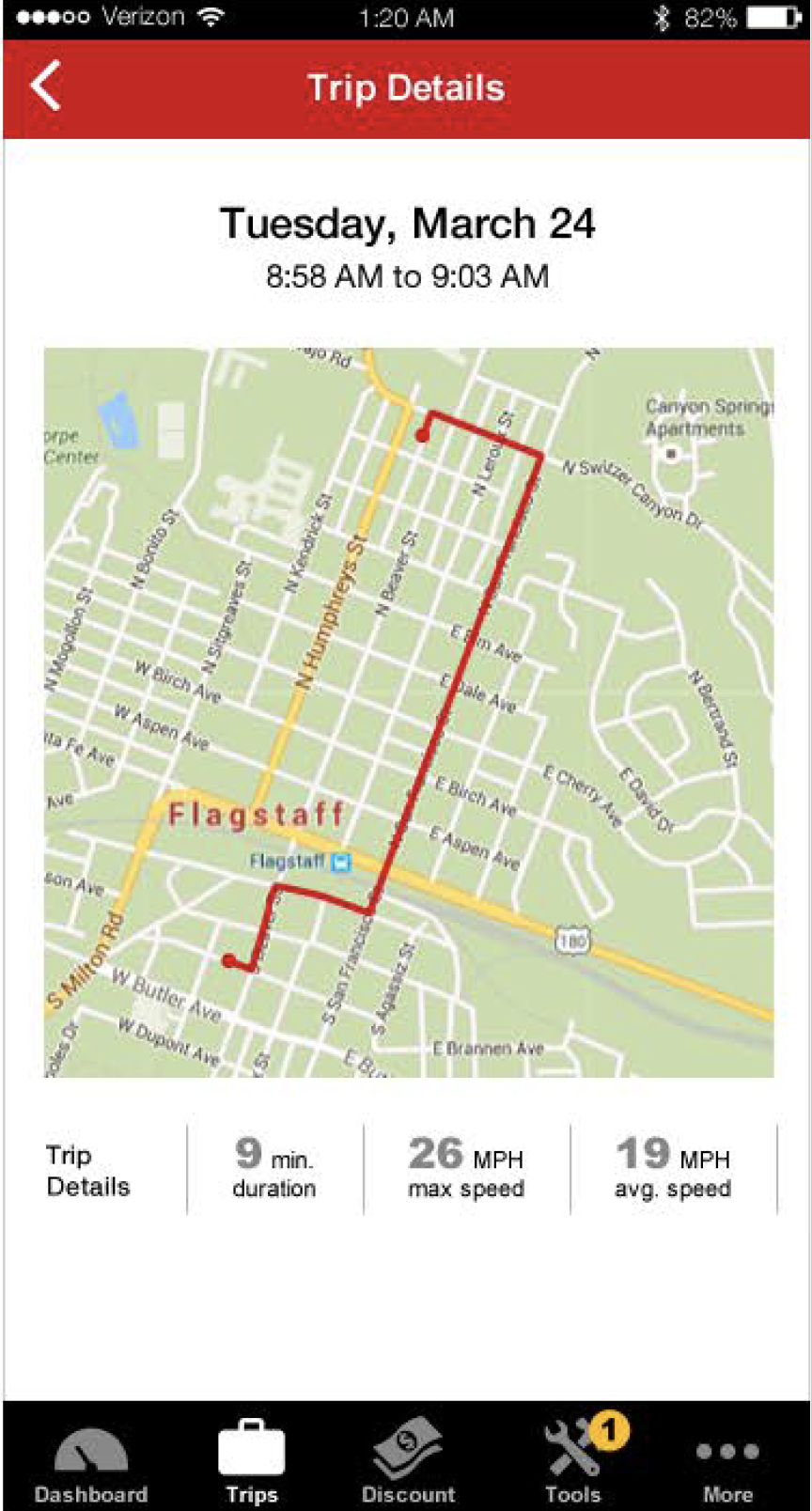
Current application
Usability Testing measured setup, data retrieval, design, layout, and navigation. Sessions were conducted in-house at State Farm’s usability lab in Atlanta, included six participants, and were 45 minutes each. The findings concluded that setup was an issue, the design was too basic, and data was complex and challenging to understand.
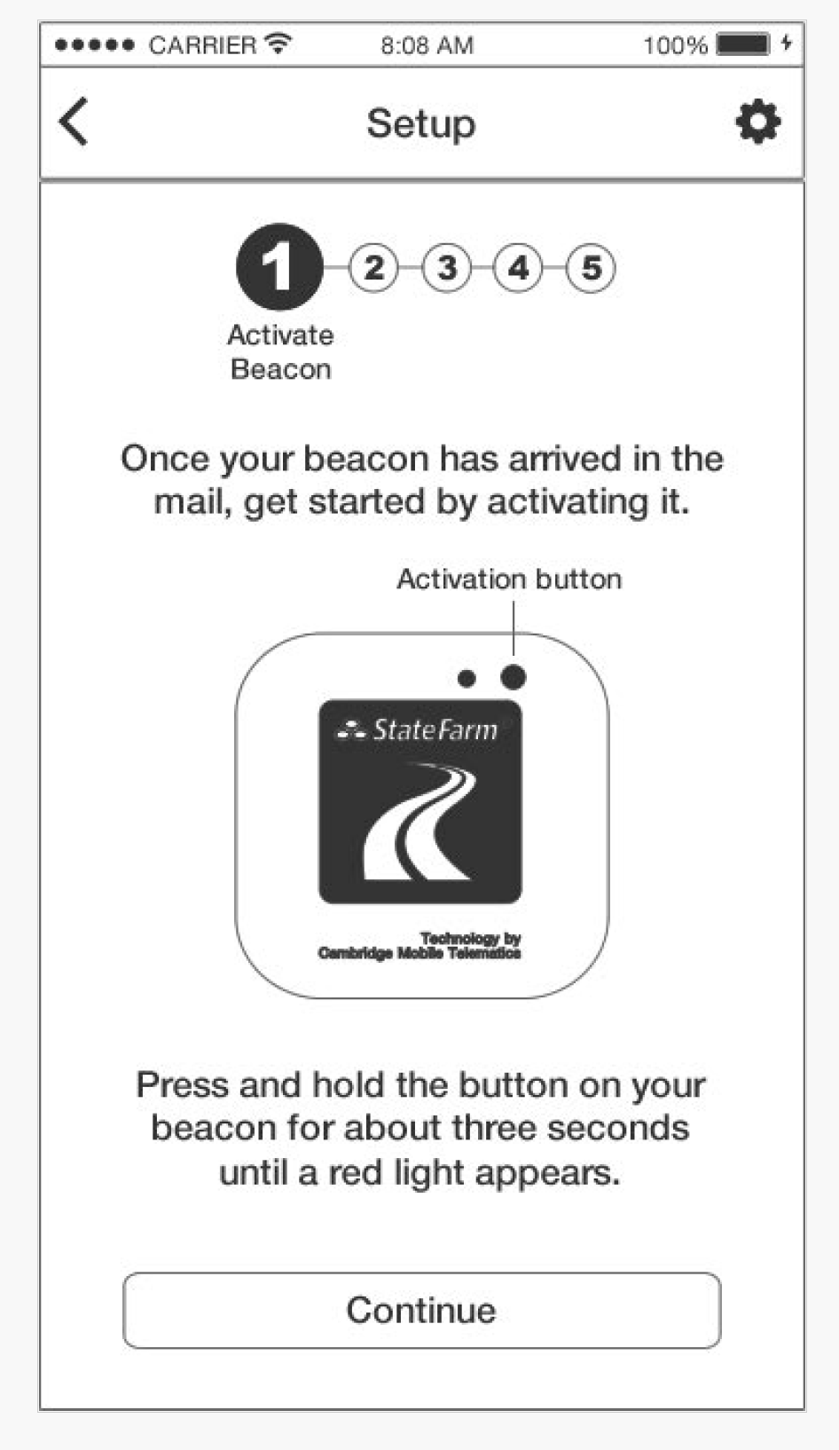
Prototype
Research concluded that the simple UI design was engaging, clean, and easy to use. Participants liked the new map and trip detail features, easier access to data, and that the setup wasn’t required.